Spending months and months building an effective and useful web application or service is only half the battle that any developer must face. It might be potentially the most powerful and useful app ever created, but will users like it? Will they understand how to use it? And most importantly, will they come back and use it again? These are the three questions developers must ask themselves before they launch any app.
Apps and services are about having simplified features, finding the easiest possible method for users to interact, understand and eventually love the app. Not only do the features have to be simple they have to emphasize the sites purpose and allow users to quickly achieve basic tasks.
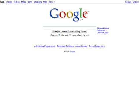
If we look at some of the biggest names in web apps and services and ask the question, what do they have in common? Have a look at Google Search, Twitter, Delicious ot to a lesser extent Flickr, and ask the questions, how did they become so popular? What distinguishes them from there competitors? The answer is simplicity. They are all memorable because they are easy to use, learn and understand and of course, they are backed up by a powerful tool as well. When you arrive at each site the function that they perform is clearly defined, they use basic navigation that everyone can understand and you can very quickly perform tasks.
There is no winning design formula to a popular web app or service, just guidelines. Nor is there a typical design style for you to follow, as this post unintentionally proves. What we have done is showcased 50 of the best designed web app and service web sites, broken down into the following categories: Clean, Simple and Nice Designs, Minimal and Effective, Vector and Large Background, Corporate and Professional, Modern and Typical (Web 2.0ish), Stylish and Classic, Graphically Improved and Flash, Flex and AIR Designs.
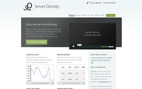
Server Density
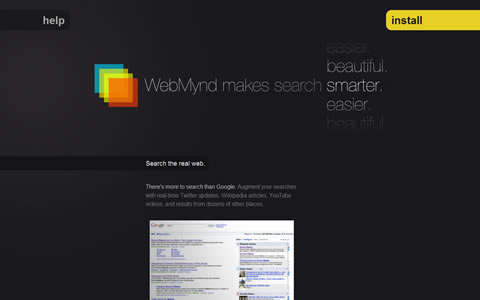
WebMynd
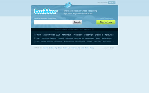
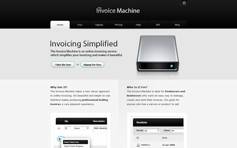
The Invoice Machine
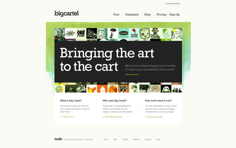
Big Cartel
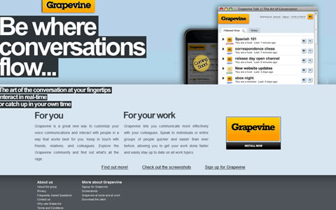
Grapevine
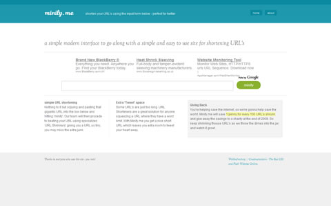
Minify Me
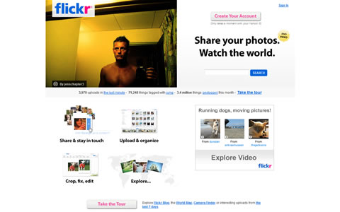
Flickr
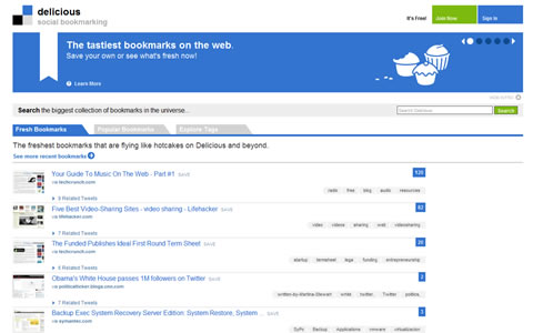
Delicious
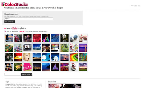
ColorSuckr
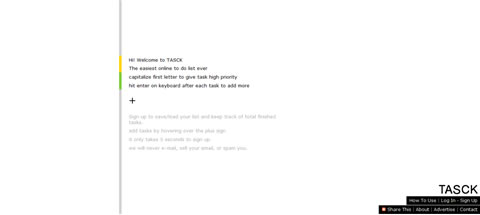
TASCK
ImgLot
Pictaculous

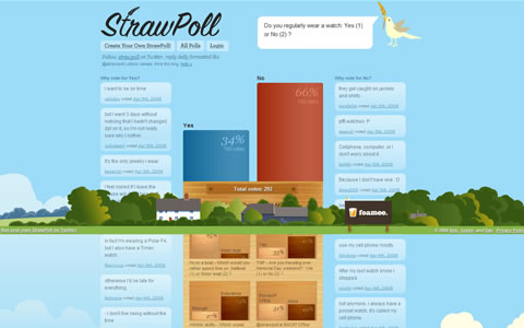
StrawPoll
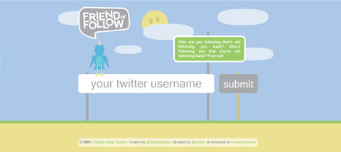
FriendOrFollow
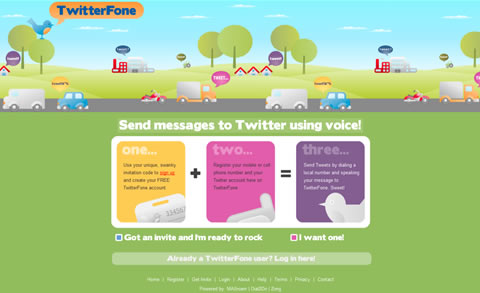
TwitterFone
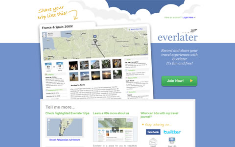
Everlater
Bet Your Followers

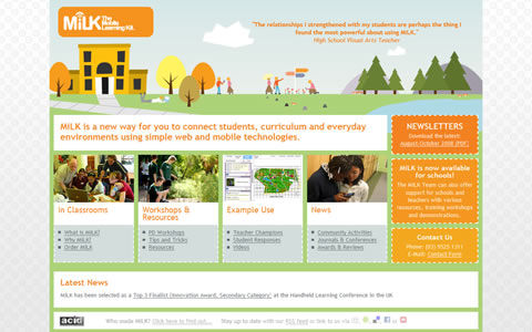
MiLK – The Mobile Learning Kit
Corporate and Professional
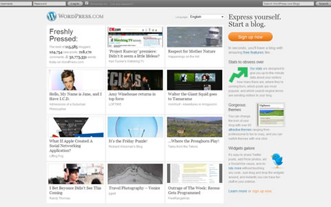
WordPress.com
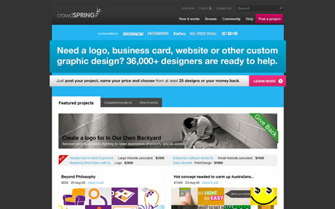
crowdSPRING
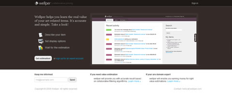
Wellper – Collaborative Pricing
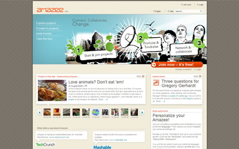
Amazee
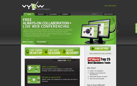
Vyew – FREE Anytime Collaboration
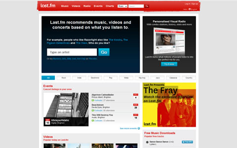
Last.fm
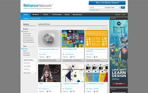
Behance Network
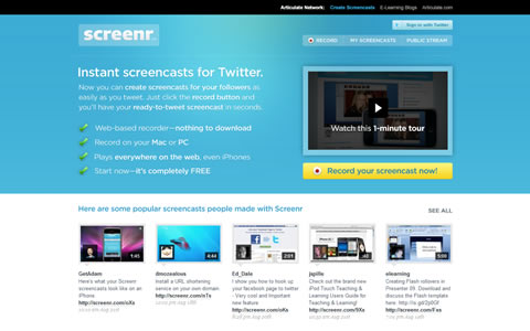
Screenr
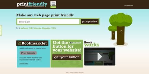
Print Friendly
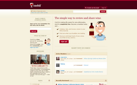
Cork’d
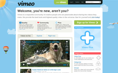
Vimeo
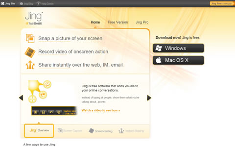
Jing
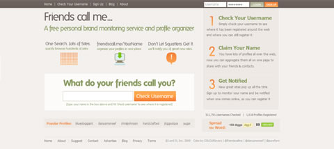
Friends Call Me
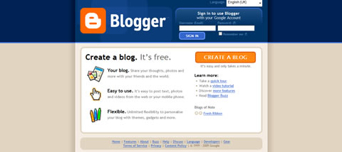
Blogger
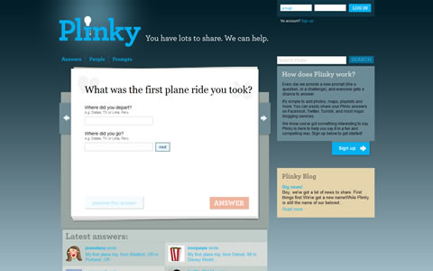
Plinky
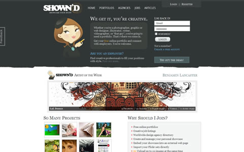
SHOWN’D
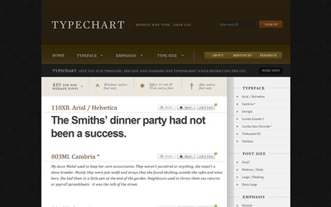
Typechart
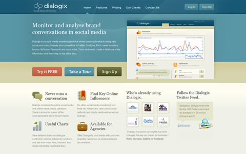
Dialogix
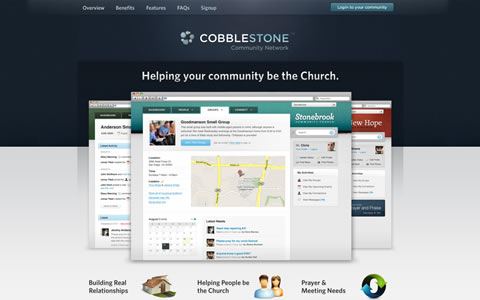
Cobblestone Community Network
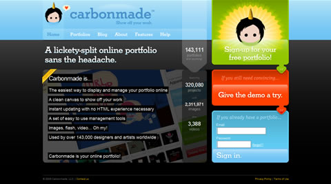
Carbonmade
Wufoo

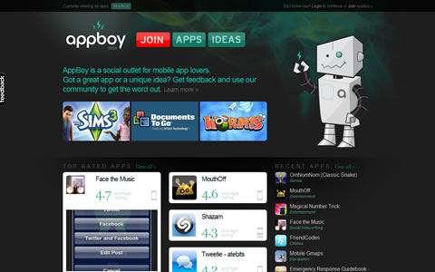
AppBoy
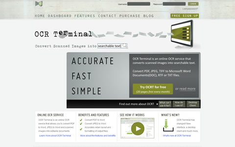
OCR Terminal
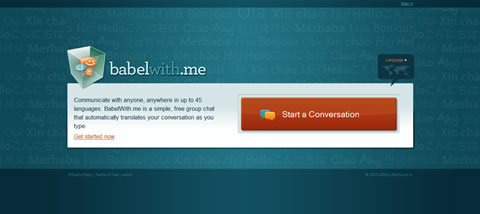
BabelWith.Me
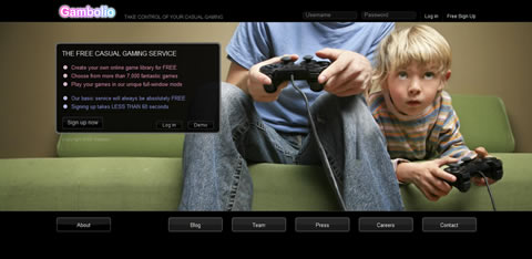
Gambolio.com
Clean, Simple and Nice Designs
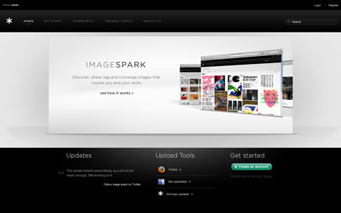
Image Spark
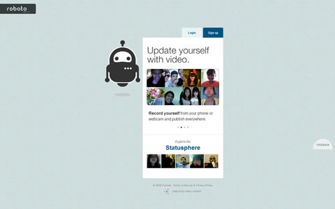
robo.to
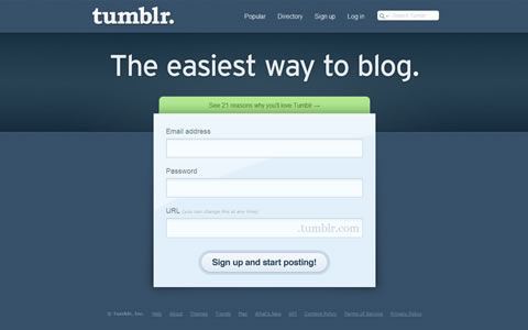
Tumblr
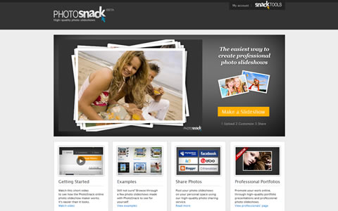
PhotoSnack
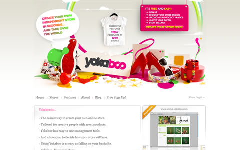
YOKABOO
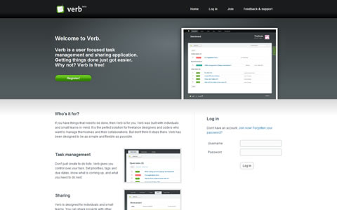
Verb
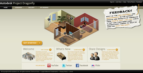
Autodesk Project Dragonfly
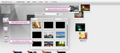
uvLayer
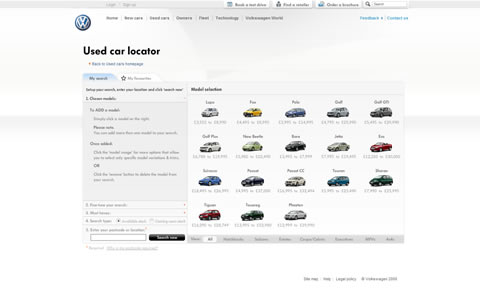
Used cars : Volkswagen UK
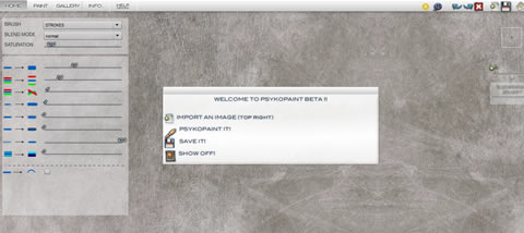
Psykopaint
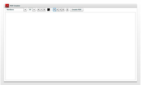
PDF Creator
When developing your web app remember this: Users hate waiting, learning, repeating, non-standard navigation and really hate overlong and overblown pointless sigup forms. How about that for a simplifed guideline?


No comments:
Post a Comment